
I asked Spotify for my extended streaming history and got back 178,269 rows going back to September 2018. Eight years, 7,597 hours, and the country I was in for every single play. No genres, no audio features, since Spotify shut that API down in November 2024.
I didn't want a Wrapped card. I wanted to see all of it at once, so I drew it as a sky. Every artist is a star. Time runs left to right, and the vertical axis is where I was living: Bristol at the top at 51°N, Mauritius at the bottom at 20°S. Plotted that way the picture composes itself, because there were a lot of movements.
Three plates came out of it. They are canvas, one self-contained HTML file each, no chart library and no framework.
Three plates
Each plate runs on its own, so they open as their own page rather than sitting inside this one. Same data, same palette, three different questions.
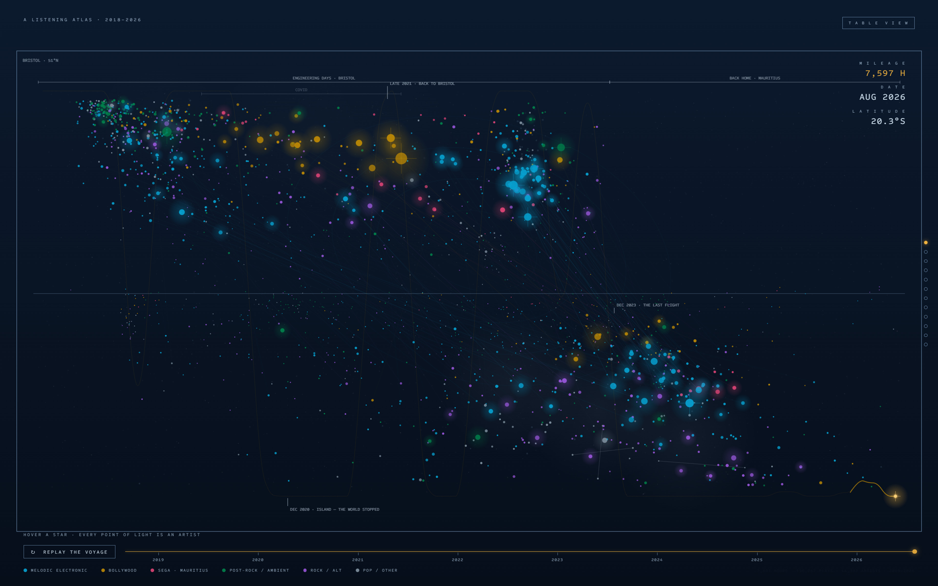
One sky, eight years wide
The scrolling one. Twelve beats from 2018 to now, the ground going from day to night, and a gold marker flying my actual travel itinerary. At the end it unlocks and you can go through the whole thing yourself.
Open the plate
The music, all at once
No time and no place, just the sound. Six identities sized by hours, artists spiralling inward by rank, and the 13,000 artists beyond my top 1,000 sitting in the dust halo.
Open the plate
Two suns, two lives
Eight years of days folded into two dials, one per country, in local time. The line across the middle is the horizon, so sunrise is on the left and sunset on the right, and each life gets a sun parked at its peak listening hour.
Open the plateBest on a desktop. All three work on a phone, where a tap does what hover does.
The sky is a map, and the map is where I lived
Plate I has to carry all eight years, so it is the only one with axes. Time runs left to right and the vertical axis is where I was living, Bristol at 51°N along the top and Mauritius at 20°S along the bottom. I only found out afterwards how literal that is: the monthly country share in the export is binary, because I am physically in one place at a time. So the gold path is not a trend line, it is my travel history reconstructed from what I played, ending with the last flight in December 2023. Every month after that is 100% Mauritius, the whole of 2024 has 0.4 hours of listening in Britain, and the northern half of the sky goes dark. That is why it scrolls in twelve beats instead of just sitting there: the sky has to fill for any of that to read. At the end it unlocks and hands you the scroller.
December 2023. After this the north stops receiving new stars.
Bollywood, drawn near. The strip on the left keeps the whole library in view while you look at one part of it.
Take away the time and the place, and the music is what is left
Plate I answers when and where, which means it can never answer what. So Plate II throws both axes out: no dates, no latitude, just six identities sized by hours, artists spiralling inward by rank, and the 13,000 artists past my top 1,000 kept in as a dust halo. The halo is there on purpose, because the tagging only covers 68.2% of my hours and I did not want a plate that quietly passes a tagged sample off as the whole library. The colours were computed rather than picked, and a contrast and colour blindness validator rejected one change that looked better to me by eye. The constellation drawn here is Bollywood, 702 hours. In 2022, the one year I was split almost evenly between the two countries, it is 15.2% of my Bristol hours and 2.9% of my Mauritius hours.
Two dials, because a day is not a year
The last question is the one neither of the other plates can hold: not which year, but which hour. Plate III folds eight years of days into two dials, one per country, in local time so that 17:00 means the same thing on both sides. The line across the middle is the horizon, day above and night below, sunrise on the left and sunset on the right, and each life gets a sun parked at its own peak hour. Bristol peaks at 13:00, in the middle of a working day. Mauritius peaks at 17:00, which here is sunset (going home), and 27% of my Mauritius hours land between 16:00 and 19:00 against 13% in Bristol. The six small dials underneath repeat the shape for each identity in both places, which is where the other half of the Bollywood finding turned up: séga is 2.1% of my hours before the return and 5.3% after. Bollywood came out when home was furthest away. Séga only came out once I was actually here.
17:00 in Mauritius, 301 hours. The same hour in Bristol is unremarkable.
Key Technical Decisions
- A play counts at 30 seconds. 23.6% of the rows are sub-30s skips, so raw play counts overstate everything. 178,269 rows become 136,267 plays, and hours are unaffected.
- The export has no genres, so I tagged the top 1,000 artists (68.2% of all hours) with Last.fm, and used MusicBrainz for country. Then I hand-checked the top 50, which caught five wrong ones, including my number three artist getting zero tags and two Mauritian legends colliding with a Japanese visual-kei band and a doom metal band.
- Stars are positioned by centre of era, meaning the hours-weighted mean play date, not first play. With first-play dates 70% of the field piles into 2018 and the right side of the sky is empty.
- The six category colours were computed, not picked. A colour-blindness and contrast validator ran over them against the dark surface, and it rejected one change that looked better to me by eye.
- Rain, white noise and study loops are not artists in any useful sense, so functional audio renders as weather over the sky instead of as stars.
- Each plate is one HTML file with one canvas and one animation loop. The site serves them as static files rather than wrapping them in React, because React never touches canvas pixels and hydrating first would only delay the first frame.
The data could tell me what I played, when, and which country I was in. It could never tell me why. That part I had to answer myself.
One sky, eight years wide.
Listening Atlas · September 2018 to July 2026 · 2026 is a partial year, data ends 16 July · Python, canvas, Last.fm, MusicBrainz